
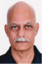
 We wanted to get to know Yateendra Joshi (NAIWE’s Research Paper Expert) better, so last month we sat down with him. Here are some thoughts he shared with us.
Everyone wants to communicate a message; how can design clarify and reinforce the message?
A well-chosen typeface can complement the message; an effective layout can clarify it; and the overall design can entice readers to begin reading a document — before the writer’s prose has had a chance to make an impact on the readers.
What are some ways to make layout more appealing to the eye and be effective across platforms?
By establishing a clear hierarchy of headings that reveals the underlying structure of the document, by choosing the right typeface, and by keeping the design simple.
Is there a rule on how many font sizes can be on a page?
More than two are too many: you can always use other cues such as weight (normal or bold), posture (normal or italics), and color.
——————
Research and academic papers – the mainstay of journals – rarely make easy reading, given the typically dense subject matter, rigid conventions imposed by academic writing, and, let’s face it, unappealing layout and design. Also, the layout and design must work across different platforms and devices: traditional print, HTML (with different browsers), PDF, desktops, laptops, tabs, smartphones. . . .
The design must also take into account how research papers are accessed because rarely are they read from the beginning to the end at a sitting. Readers skim the titles; if any is interesting, the next stop is the abstract, after a glance at the names of authors and their affiliations; if the abstract is promising, then maybe a quick scan of the results — and thus the process continues. A research paper has layers of information, and it is the job of typography and design to make those layers distinct and easy to access.
This webinar touches upon legibility and readability of type, choice and use of fonts, layout of different layers, design of tables, typesetting of references, and so on, illustrated with examples taken from a range of journals.
If you are involved in any way in text-heavy documents, this webinar will be of interest to you. More specifically, this webinar will help you to
- appreciate reader-friendly design
- notice the choices made by typographers and designers
- avoid some common but poor design choices
- explore resources on design
- enlist typography to reinforce your editing.
You can join in this conversation on November 18, at 2:00 pm eastern, when NAIWE will host a discussion on typography and scientific journals. The cost for NAIWE members is only $10! Nonmembers can join for $30. Register today!
 We wanted to get to know Nicole Evelina (
 NAIWE is always looking for those who excel and who may want to be an asset as a member of the Board of Experts.

 We wanted to get to know Ruth Thaler-Carter (
 This summer, NAIWE is challenging you and your fellow NAIWE members to be the best version of yourselves. You may personalize this challenge to fit your needs and summer goals. Choose a book to read that you classify as a self-help book even though its genre is far from that. Choose a project that has been nagging at you but will also produce great reward upon completion. And finish the challenge by spending some quality time with our experts learning how they mastered creating multiple steams of income. Throughout the challenge, be true to yourself and your goals!
 We wanted to get to know MJ Courchesne (
 We wanted to get to know Suzanne Lynn Cheesman (
 Now is a great time to think about attending one or two conferences over the next 12 months.